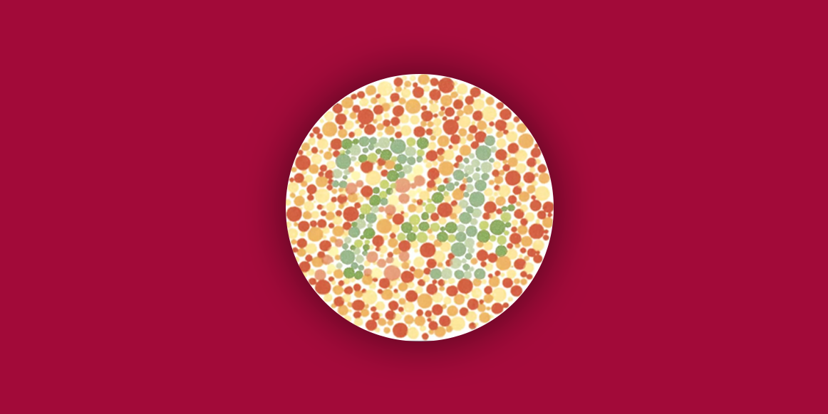
Which number do you see in the image above? 21, 74, or none? If you do not see the number 74 you may have some kind of color blindness.
Color blindness is a deficiency in the eye cells that affects the perception of colors through light. A color-blind person is not able to see, depending on the type and degree of color blindness, the colors green, red or blue. In some rare cases of color blindness, no color is captured by the human eye and is known as monochrome.

It is estimated that about 1 in every 12 men and 1 in every 200 women have color blindness in the world. This is because the number of cells that capture light in women’s eyes is greater than in men. It is rare for women with color blindness. If you put the tip of the pencil, we have approximately 8.35 million Brazilians who have some type of color blindness, being 7.83 million men and 523 thousand women.
RGB x Color Blindness

If you see the 3 colors above as red, green and blue you have what is called normal vision. Below is a comparison between normal vision, and the different types of color blindness:

Types of Color Blindness
There are 4 known types of color blindness:
Protanopia
Those with this type of disability tend to notice the less red light. Tones of red, orange, and yellow tend to become green and less saturated.
Deuteranopia
The person has difficulty in perceiving the green light and this damages the distinction of blue, yellow, violet, red, and green light.
Tritanopia
People with tritanopia confuse blue with green and yellow with violet.
Monochromia
It is the absence of the ability to differentiate colors, resulting in grayscale vision. This is a rare type.
The market gap
Unfortunately, color blindness is still seen as something of little relevance because there is a much smaller public that has this difficulty. Companies that produce products or provide services do not always take this into account and this directly affects how these people experience products and services.
Adapting the interfaces
An example is the traffic lights that work with color and light differentiation. For color-blind pedestrians, it is much easier to understand what the state of action is through icons than with colors only. Auditory feedback helps to improve the experience.

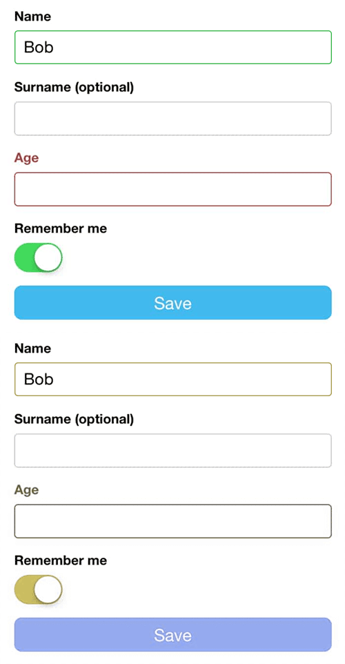
In site forms, it is very common to have the same scenario. The validation of the fields almost always follows the convention of green for success and red for error, but not always accompany an icon or some visual element informing the status of the action, damaging the accessibility for this audience.

In games platforms or mobile, it is extremely important to maintain the concern with colorblind users. In the Far Cry Primal game example, the interface shows the enemy on the mini-map in red and the ally in green. The colors are practically the same and this can cause confusion or a delay in the learning curve on the part of the player when he is in hunter view mode.

How to design for color-blind speakers
Color Contrast
Use color contrast. Even those who have monochrome have difficulty perceiving the different variations of light. To ensure that there is reading it is important to define colors that have contrast. An example: a white text on top of a dark background color will have more contrast than a white text on top of a yellow background. Recently I created a post talking about contrast and how to improve accessibility.
Use different types of shade instead of different types of colors
Este método de construir o design por meio de um esquema monocromático ajuda a diminuir efetivamente a frustração entre cores e ajuda a criar bons contrastes.

A blue scheme, for example, allows the reading to be completely readable without compromising creativity. It is important not to confuse the monochromatic scheme with the monochromatic type of color blindness. To avoid creating a monochrome scheme of black and white contrast in your project.
While creating, try color blindness
Yes. It is extremely important to put yourself in the place of users when creating something. Some tools that simulate the look of a colorblind. Plugins for Sketch and the preview mode in Photoshop allow this simulation.

There are other tools such as Colour Contrast Analyser to test the types of color blindness in design projects.
Accessibility is part of the brand
We can’t always define which colors we will work on projects that involve a guideline already chosen. Looking at colors is an extremely important point to pass the values of the brand, but thinking about accessibility for colorblind people is as important as that. If you are creating your project from scratch, consider avoiding these color contrasts in your brand.

Use textures instead of colors
As said before, risking the decision making of some action based on colors is not a good practice for accessibility. Whenever possible, visually indicate the difference of each element based on color using primitive shapes or patterns that can be generated from free services or through software such as Illustrator or Sketch.
Trello uses this approach in its tagging system, bringing value to the colorblind user.

Conclusion
The lesson learned here is the importance of this subject for the professionals who work with UX Design so that the largest number of color-blind people can use the products and services without having to suffer from it. Using isolated colors for important messages is not a good practice. Whenever possible, appropriate shapes, icons, images, and other visual elements to increase ease of use. In the end, our user needs to have a satisfying experience, and looking through this lens, accessibility has much value within the user-centered design process.
See you next time.


