

2018 / Multiple projects
04. GOL Airlines
Improving the purchase experience and use of the products of the largest Brazilian airline
Context
GOL Airlines is the biggest airline company in Brazil and has a lot of challenges through digital products. During my journey working at GOL, I faced different opportunities to improve my skills and learning from problems using the design process to help people buy tickets and have a pleasurable experience during their trip.
My role
Product Design, Information Architecture.
01. Designing an online experience in a physical environment
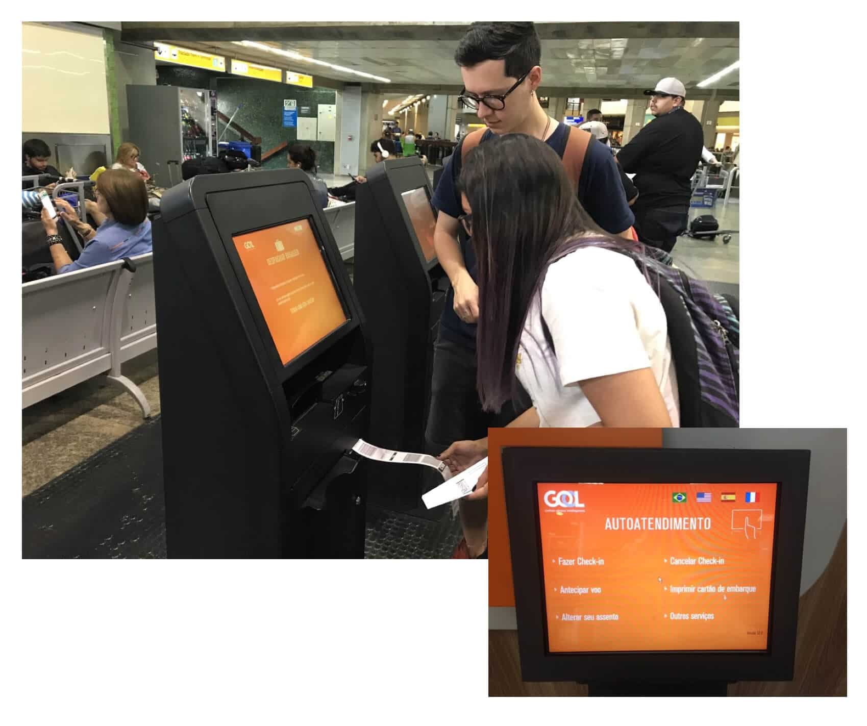
Totem / ATM Redesign
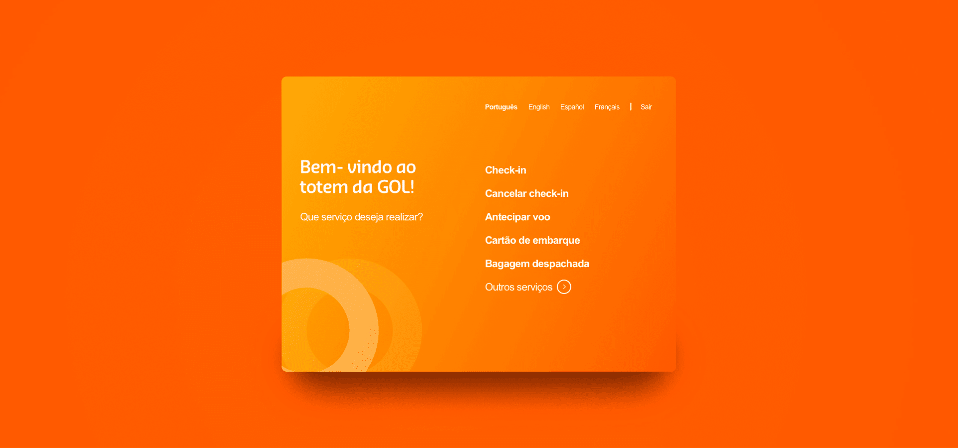
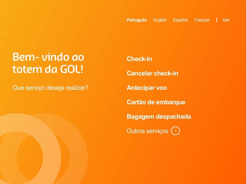
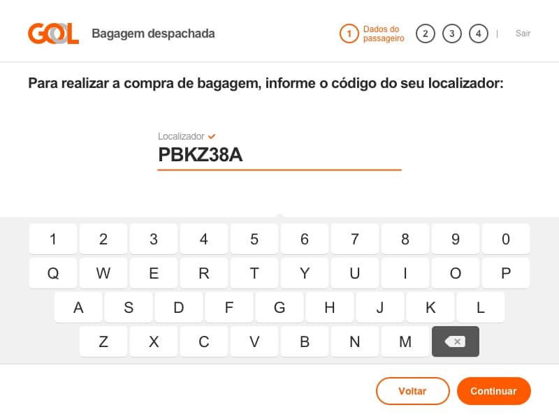
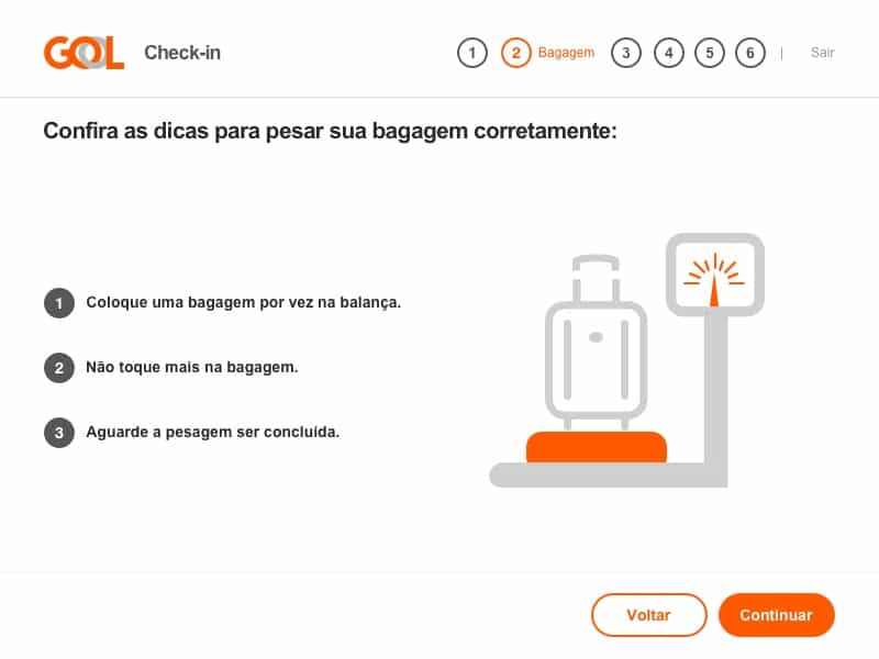
The challenge was to redesign the interface of GOL check-in totems on Congonhas Airport - SP - BR. This included the understanding of how travelers spend their time on the check-in and delivering their baggage, it was an essential part of the project. The goal of the redesign was to let the process faster and with less line on totems.
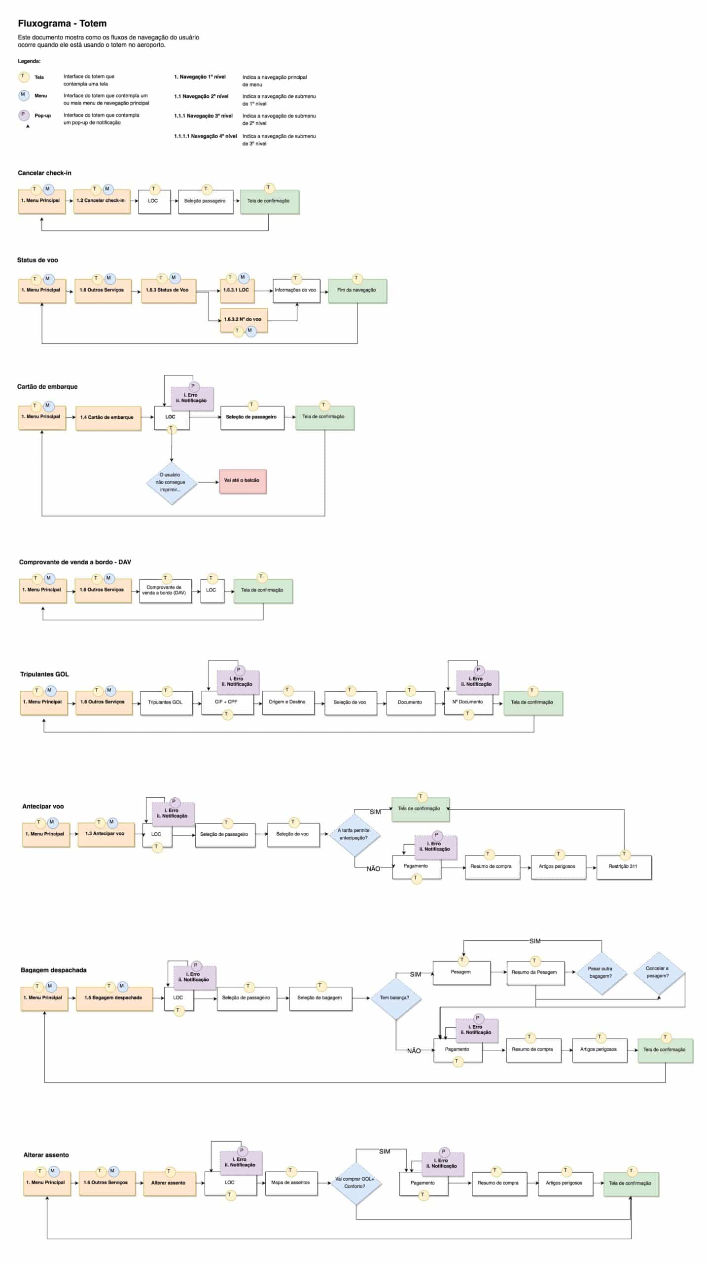
Mapping the user flow
To redesign the flow, it was necessary to understand how it is built and what its particularities were in the user interaction flow. With the help of GOL's Airport Division team, meetings were held to understand what were the main pains of users at airports during the check-in process.
01
Users take time to check in totem
02
the totems have technical navigation limitations
03
the totem interface is not friendly
Working with physical device
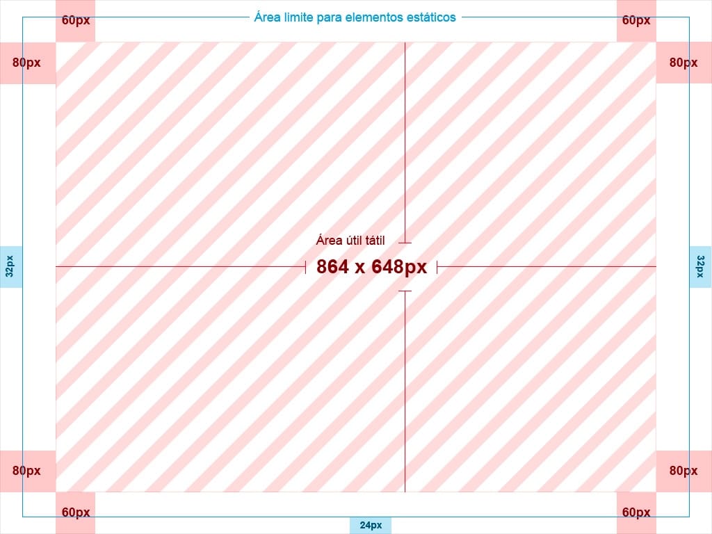
Design for totems isn't the same thing that design for mobile devices. The first thing to know is about the technology used in totems, the screen size, resolutions, and how many interactions the user can make per time. The Congonhas Airport totems are from the same partner and have the same configuration, but most of the time screens have different sizes and resolutions. The guide below helped the developers understand the limitations.
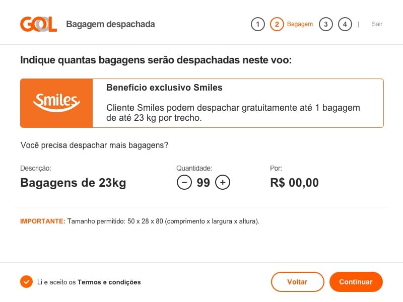
Building the user interface
From design specification, the biggest challenge was to design an interface that allows limited interactions per screen. It wasn't easy, once there is a lot of information and components on the same screen. The seat map shows the list of 9 passengers on 2 screens - 1 to 5, 6 to 9. This limitation happens because the totem doesn't scroll up or scroll down on the screen.
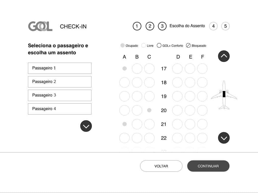
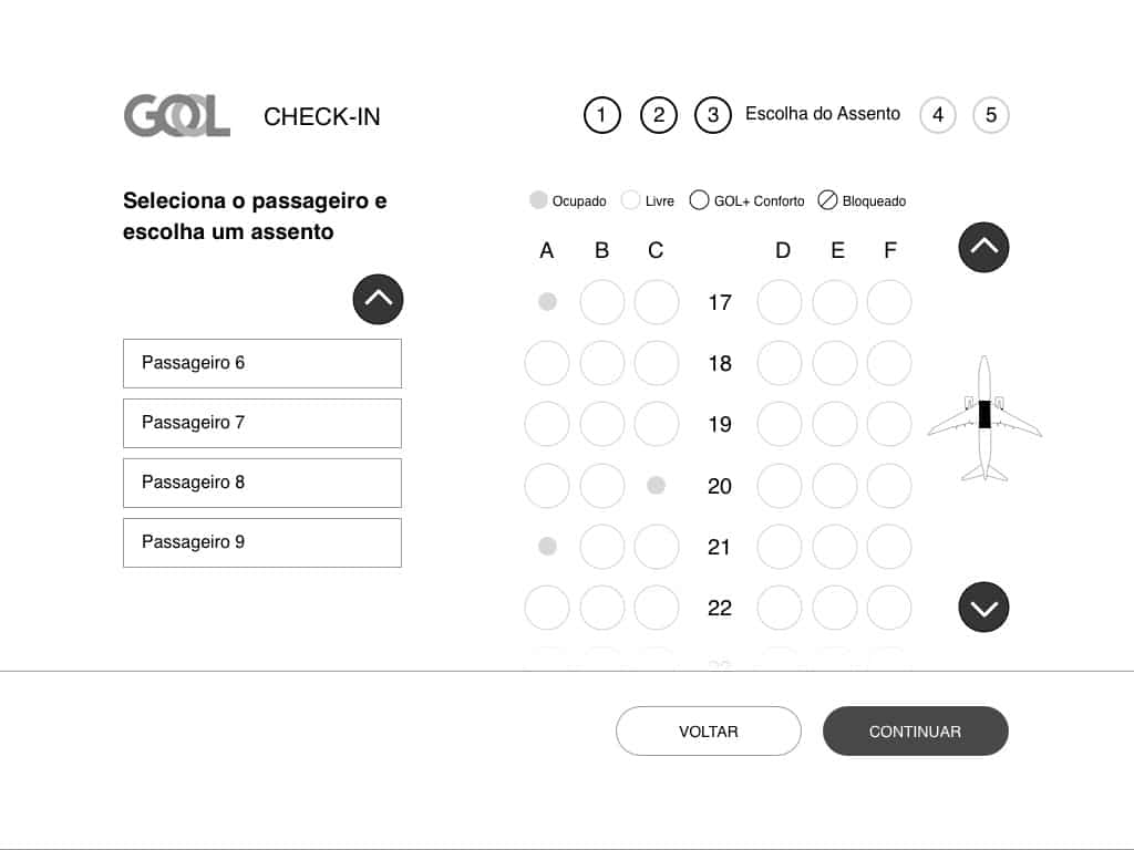
To redesign the other screens the guideline was the same: limit the interactions that need scroll and simplify the information on the screen. The result is an interface really close to the current app, with improved usability for totems. The decision comes from the app to learn curve and brand guidelines.
02. Improving the website
A/B test on the website homepage
The goal of this project was to bring more sales revenue to the company and partners on the website. With the marketing team, we realized the website homepage could be improved. So we brought the partners as mini banners, above the line fold to alert the user of the benefits available on the GOL website.
The first action: identify where to put the mini banners and lift the interface.
Second action: study, sketch alternatives, and implement the A/B test.
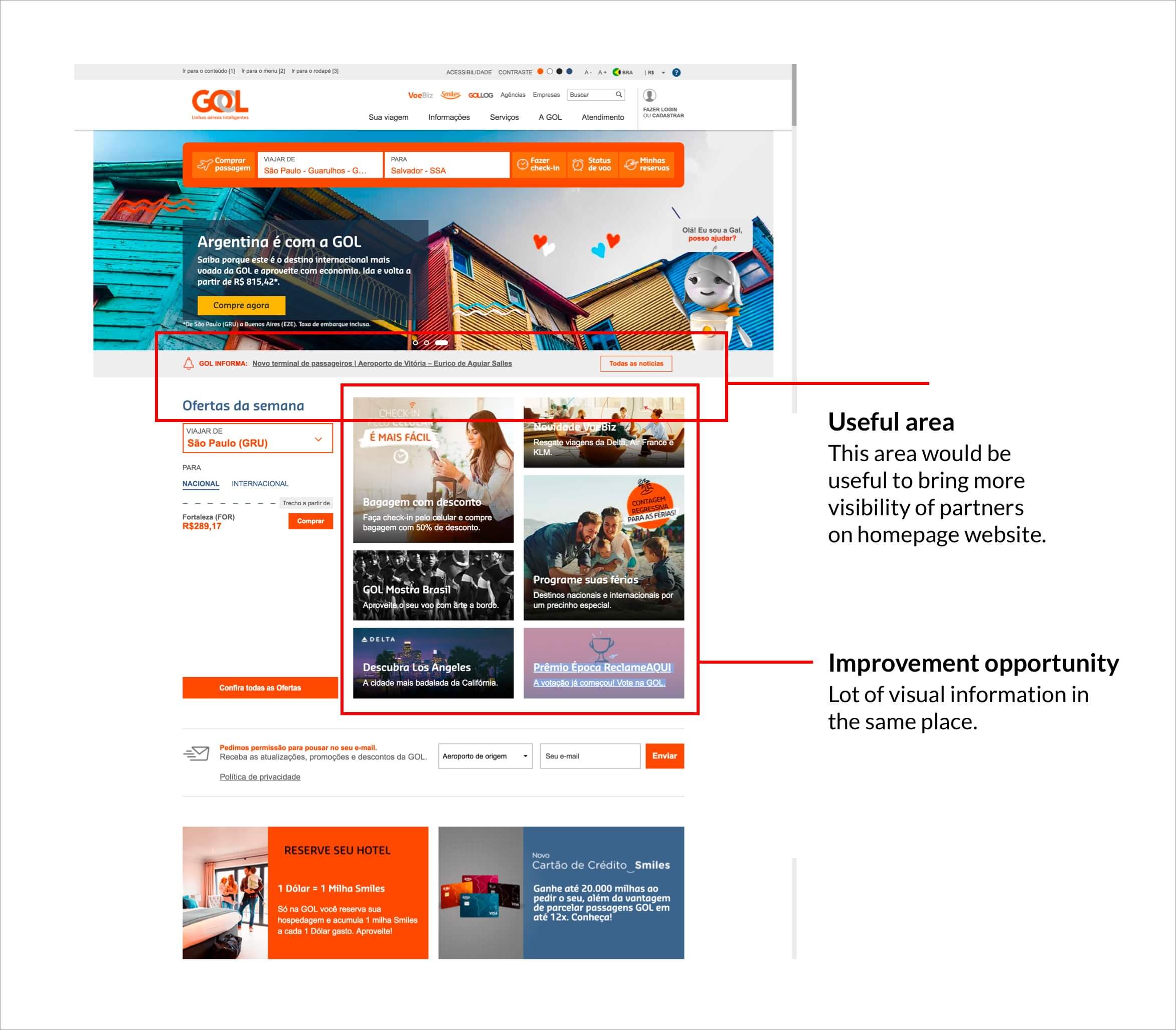
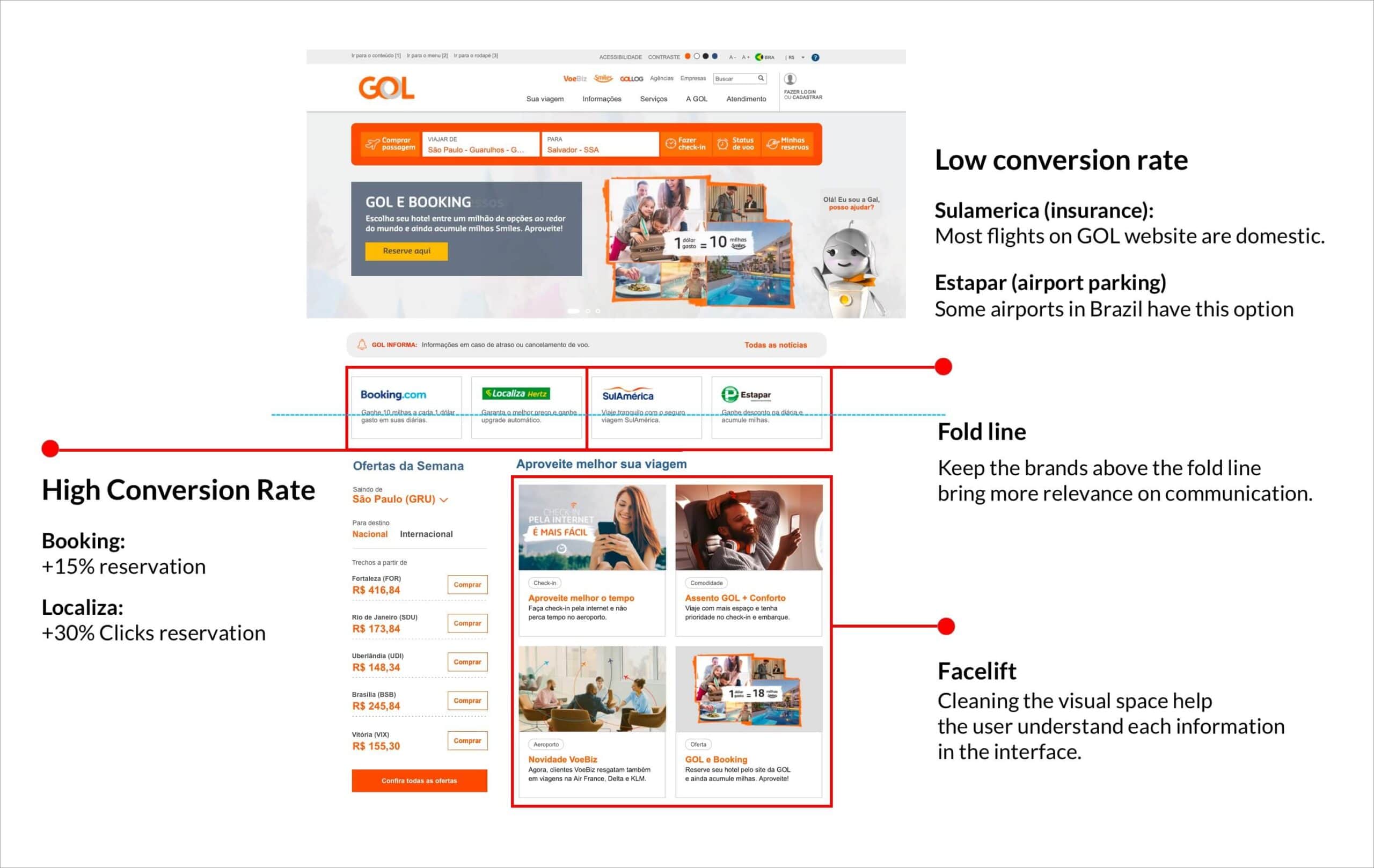
The result was very good for partners and for sales revenue. We improved the conversion rate on Booking and Localiza on the website. Now, we keep this structure on the web changing the position of the mini banners to test new ideas and products. You can check this job on voegol.com.br.
Learnings
1. The biggest challenge of this project was to design an interface for a physical device that isn't present on my day of work. Go to the airport and see how people use the ATM is very crucial to understand the device limitation and how much time they spend trying to complete the check-in task.
2. To test something on the GOL Airlines website isn't simple, because we have a lot of integrations and security limitations to implement something online. But, the culture to test small changes made the company understand how important it's to create value and generate insights to keep evolving the product.